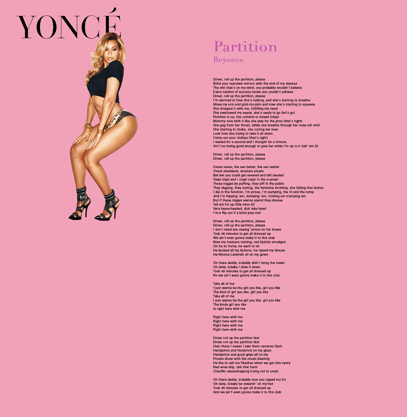
Feedback from Jin
- text is small
- title treatment could be more extreme
- pink is too soft for the tone?
- consider flowing the text instead of two columns
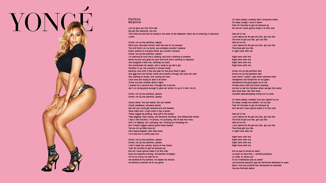
Feedback from Maddy
- decrease size of artist name to have clearer hierarchy
- increase leading
- bodoni for title to fit with yonce
- align top of body text to bottom of "YONCE"